Strictly monochrome
Black, near-black, white, and neutral grays only. There is no chromatic brand color — the one structural accent is ink itself. The single reserved color, a danger red, appears only for destructive actions.
KaiZenly+ is designed to feel like a quiet document, not a busy dashboard. The goal was never to pile on features and colors — it was to give you a clean, distraction-free environment where you can manage your routine, habits, focus sessions, journal, and mood without visual noise.
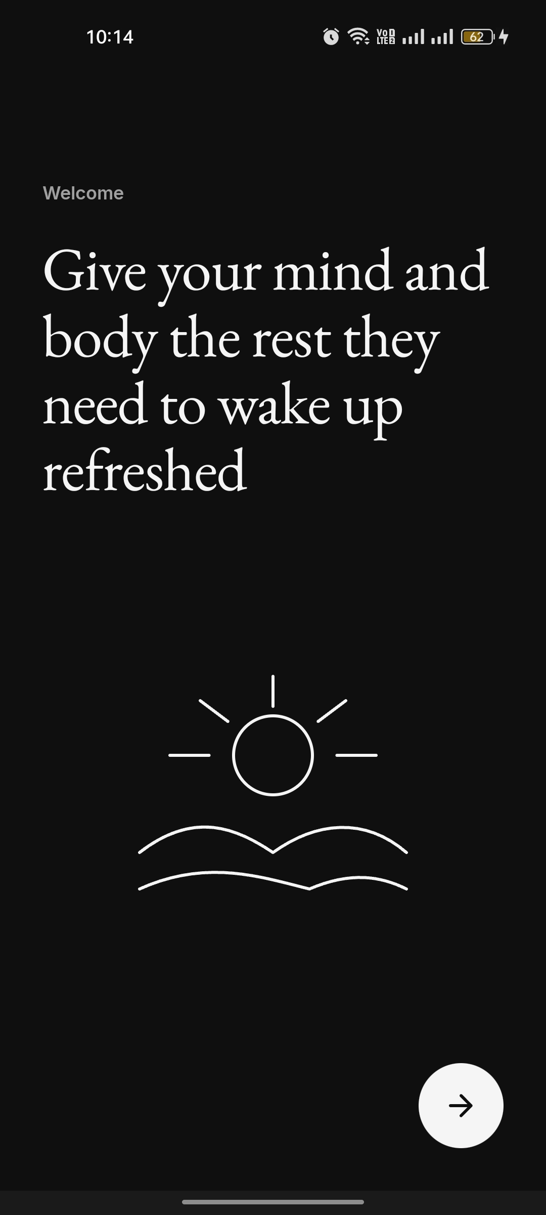
The whole system is strictly monochrome with editorial serif typography — a deliberate contrast to the cluttered, colorful UI of typical productivity apps.
Black, near-black, white, and neutral grays only. There is no chromatic brand color — the one structural accent is ink itself. The single reserved color, a danger red, appears only for destructive actions.
The interface is designed to reduce visual noise, not add to it. Whitespace does the grouping; there are no loud banners, no color-blocked tiles, and no busy dashboards.
Each screen shows one clear thing at a time — your habits, a focus session, a journal entry — so nothing competes for your attention.
A serif display face (EB Garamond) carries headlines and big numbers, paired with Inter for body and UI. It reads more like a calm long-form reading app than a productivity dashboard.
A compact, equal-width bottom navigation and one consistent design system across habits, focus, journal, mood, and insights — so the whole app feels like one quiet place.
Cards are flat with 1px hairline borders instead of heavy shadows. Buttons are fully pill-shaped. Depth comes from the monochrome canvas-to-ink ramp, not drop shadows.
Dark is the design anchor, with a light theme that is the same product recolored — only palette values change, never the layout, spacing, or shape.
Considered type, generous spacing, and restraint give the app a premium, editorial feel without noisy decoration or gimmicks.
Most productivity and focus apps fight for your attention with bright colors, badges, and dense dashboards — the very kind of noise you are trying to escape. KaiZenly+ takes the opposite approach: a strictly monochrome palette, generous whitespace, and a single consistent design system across every screen. The result is an app that feels calm to open, easy to read, and effortless to navigate.
Emphasis comes from typography and ink weight, not color. Headlines use a serif display face at a regular weight; numbers like streaks and focus minutes are set large and quiet. Cards sit on the canvas with thin hairline borders rather than heavy shadows, so the interface stays flat, light, and document-like.
The same design language carries across habits, focus, journaling, mood, and insights, in both dark and light themes. Nothing is bolted on; everything belongs to one coherent, distraction-free experience — which is exactly what a self-improvement app should feel like.